Stagwell Marketing Cloud (SMC) is a SaaS company that houses various tools to help small and large businesses completely transform their marketing strategy. Stagwell, a global marketing agency and the parent company of SMC, uses SMC to tap into the technology-focused market. SMC has three main business units:
Prophet Comms Tech: Deploys AI technologies to predict earned media interest, unlock advanced audience analytics, and optimize crisis responses.
The Media Studio: Encapsulates the customer using media mix modeling, media spend forecasting, location data from consumer devices, and audience segmentation insights.
Harris Quest Research: Harnesses AI power for insight tools that allow clients to conduct real-time research to improve customer experience, test campaign concepts, measure ad recall, evaluate brand perception, and validate brand strategy.
Impact
I prioritized Objectives and Key Results (OKRs) to effectively secure continuous support from crucial stakeholders across the entire organization ensures a unified focus on achieving our goals and driving success at every level.
Business
Grow SMC’s product offering and client network.
Brand and Marketing
Integrate all business units within a unified SMC framework.
Design & Product
Build familiar and delightful experiences for complex tools
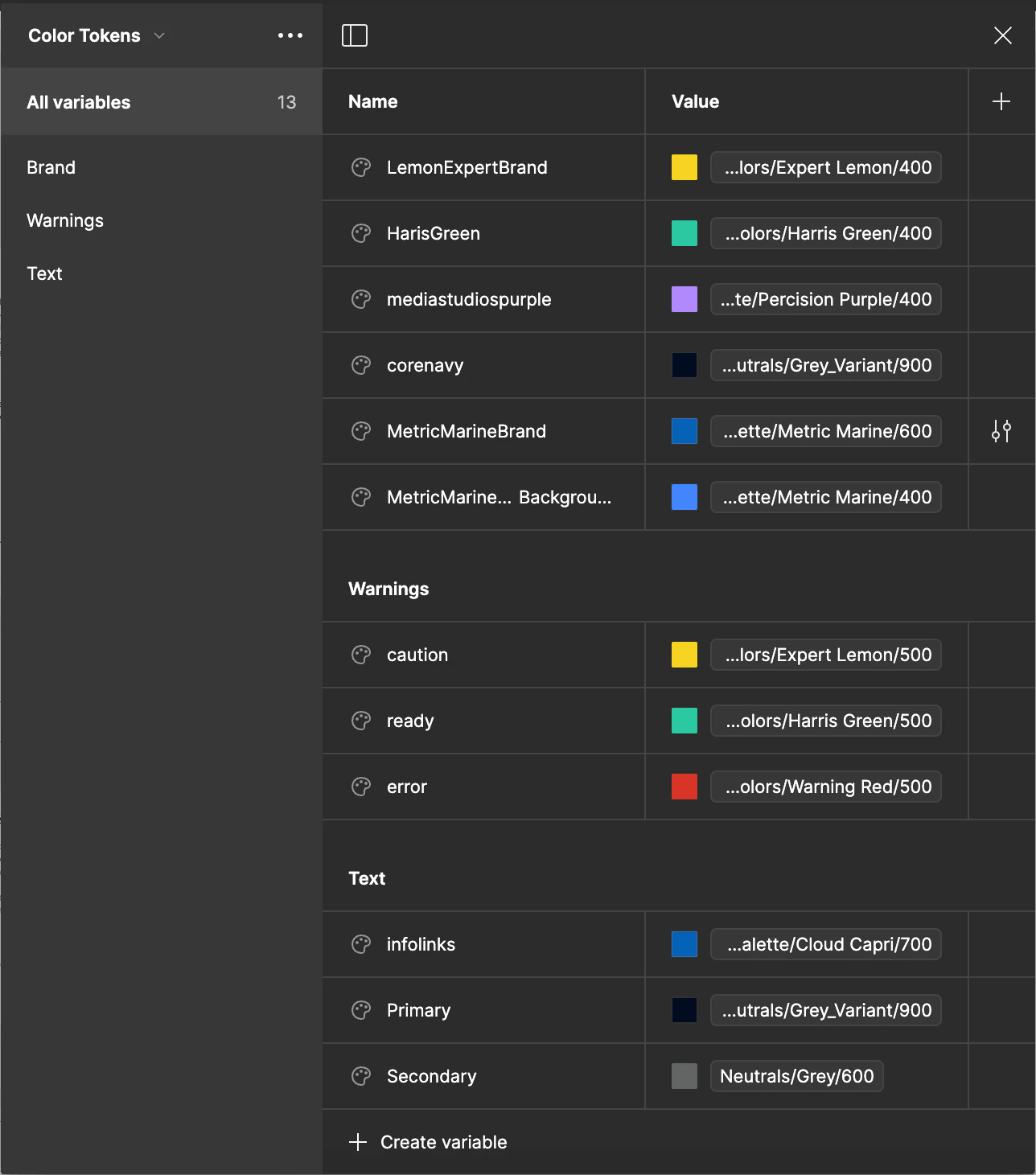
The color palette is a foundational component the design system depends on. Concurrently, the completion of the color palette has a direct effect on all marketing materials, including the SMC website, the branding guidelines, and product and investor pitch decks directly influencing important business OKRs.
15% Retention
The design system has already caused a marked 15% increased in client retention for SMC's tools.
10% Saved
Internal feedback has been that the design system saves them and the engineers hours of time (money) each sprint.
Understand
The Task: Finding the Balance
A new SMC design system required a new color palette. This project (the entire design system) is an exercise in balance. Finding the sweet spot between business, branding, and product.
Timeline: 1 Sprint
Deliverables:
Key components
Updated Developer Storybook
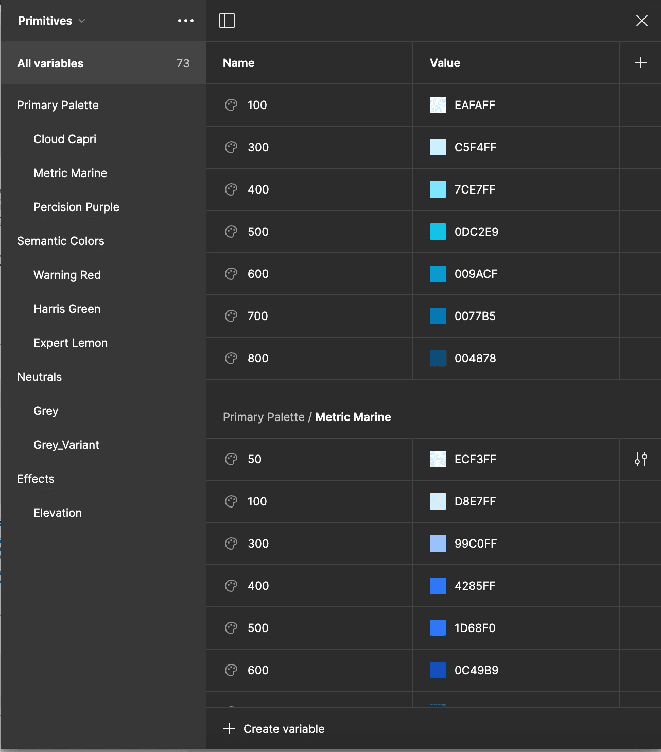
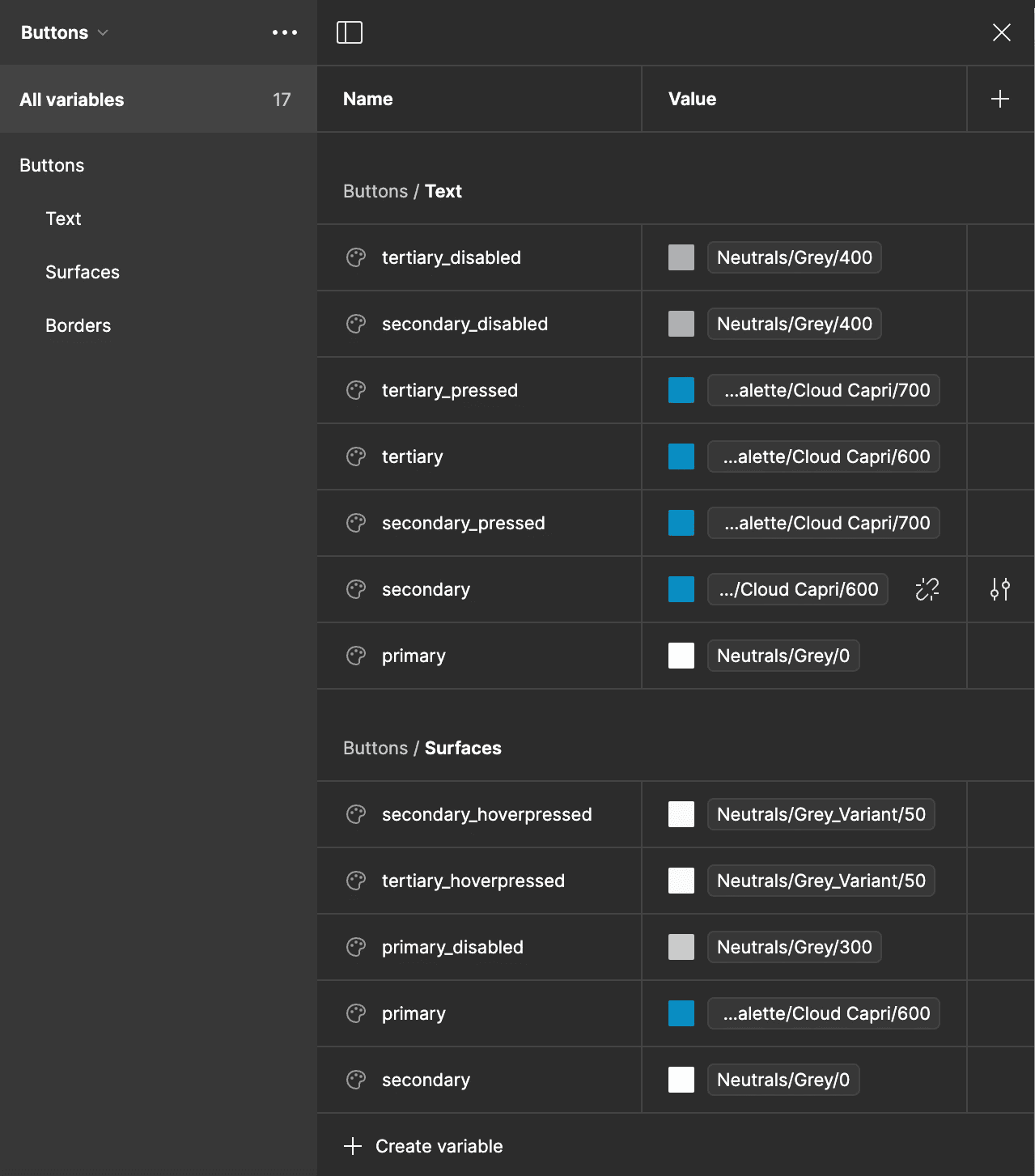
Variables and Design Tokens
Detailed Usage Guidelines
Each stakeholder had a specific priority:
Stagwell CEO: Give SMC is a distinct refresh, without straying too far from the trusted and familiar Stagwell Brand. *Also, expand SMC’s client base and increase user retention.
Branding and SMC CEO: Create a modern, tech focused brand identity.
Product (Me): Create an accessible, and delightful brand identity that can display data dense complex user experiences.
The Problem
The current palette:
Does not meet accessibility standard with low contrast ratios
Has no clear guidelines creating inconsistent usage across business units and products
A limited shade range, with inconsistent, incorrect increments reducing branding and data visualization options
Unclear naming system making development difficult and time consuming
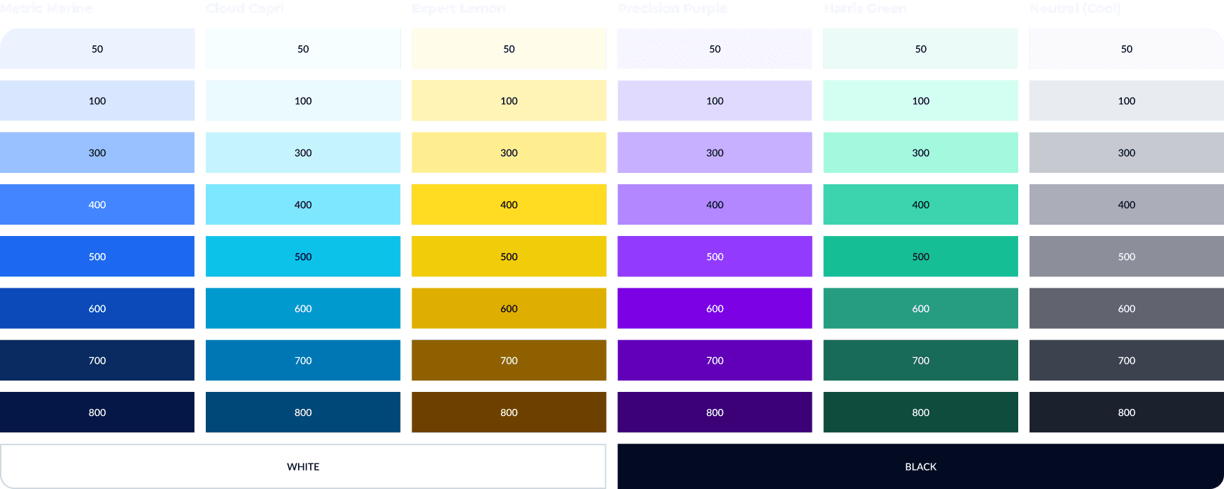
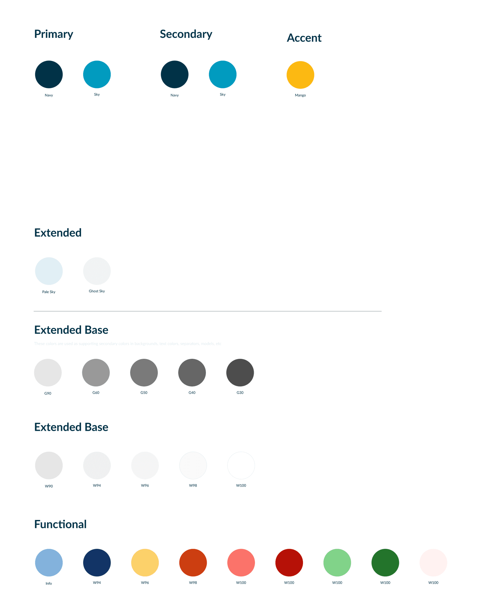
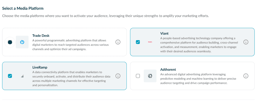
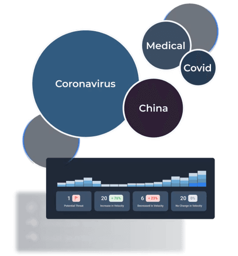
Take a close look at the "palettes" in the first picture, the usage of color with the product and the examples of data visualization.
Ideate
Making Palettes
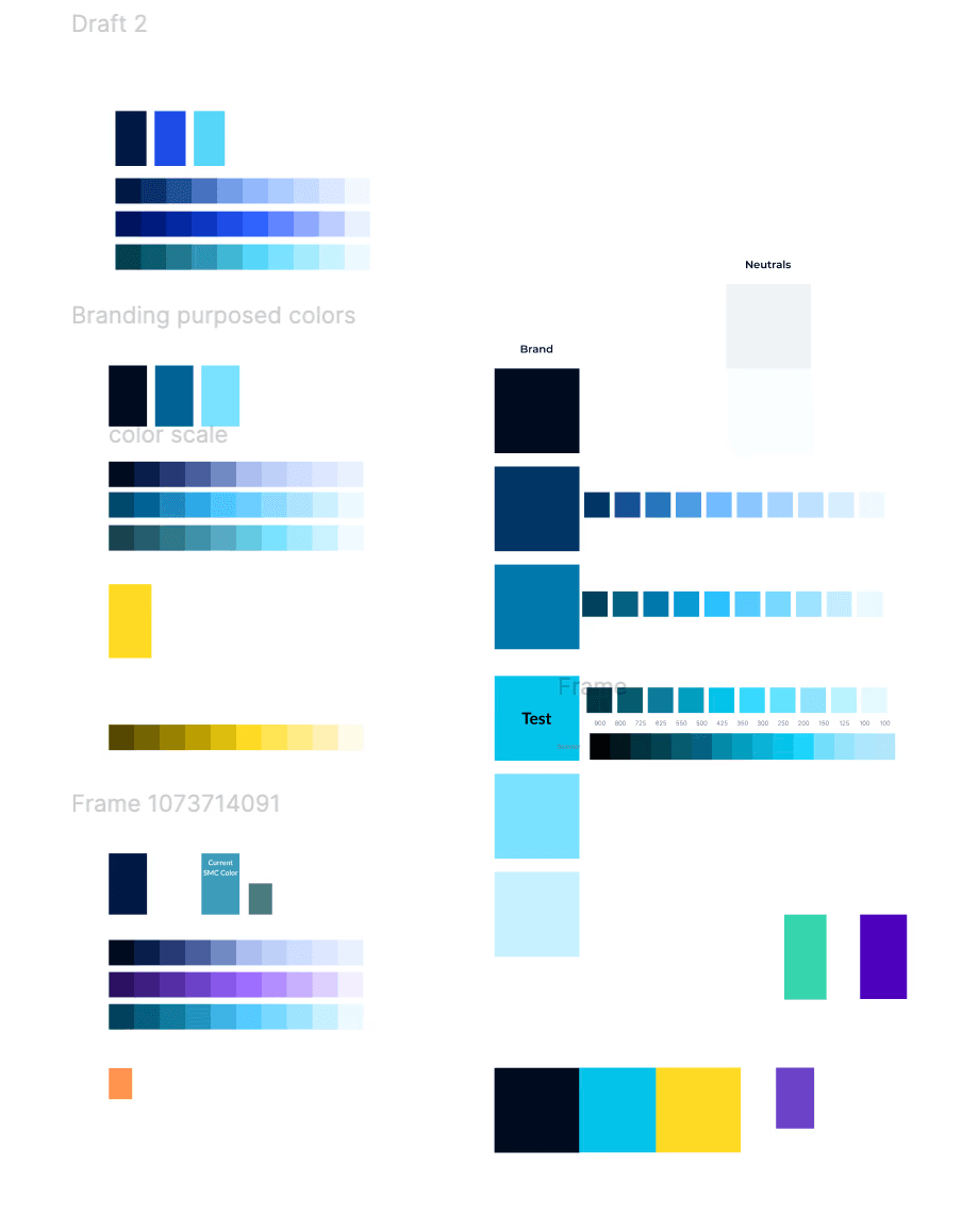
Building the ramps showed glaring issues including:
The teal color that is was essential the the Stagwell brand was not accessible.
Expanding on the teal colors created green "muddy" shades that looked dull in the product - this creates bad UX we need a flashy noticeable CTA.
The ramps are not consistent, and don't stay true to the color.
Additionally, we have decided to give each business unit its own color that is easily incorporated into the each product. These colors need to compliment each other and the primary palette.
HSL vs OKLCH
I did a deep dive into color. Learning about the difference between the way we built colors ramps for products, and how this affects accessibility. The TL;DR we use HSL but OKLCH is better.
OKLCH offers better perpetual uniformity, so it's easier to create color ramps, and keep colors consistent. Perpetual Uniformity also aids in building accessible designs.
A little more detail if you're curious
*For more information I suggest checking out Ashley Seto's Config 2023 talk on the topic and Atmos's palette creation tool and blog.
Color Space:
OKLCH: Based on the Oklab color space, which is perceptually uniform.
HSL: Based on the RGB color space, which is not perceptually uniform.
Intuitiveness:
OKLCH: Intuitive like HSL, with values for lightness, chroma (saturation), and hue.
HSL: Intuitive with values for hue, saturation, and lightness.
Perceptual Uniformity:
OKLCH: Provides uniform perceived brightness and more predictable color transformations.
HSL: Lacks perceptual uniformity, leading to unexpected results when modifying colors.
Color Range:
OKLCH: Can represent a wider range of colors, including those in the P3 color space.
HSL: Limited to the sRGB color space.
Lightness:
OKLCH: Lightness is more accurate and consistent across different hues.
HSL: Lightness can vary significantly for different hues at the same value.
Saturation/Chroma:
OKLCH: Uses chroma (0 to ~0.37), which more accurately represents color intensity.
HSL: Uses saturation (0% to 100%), which can lead to inconsistent results across hues.
Hue:
OKLCH: Hue values are shifted compared to HSL, with red at ~30°, green at ~140°, and blue at ~260°.
HSL: Traditional hue wheel with red at 0°, green at 120°, and blue at 240°.
Accessibility:
OKLCH: Better for creating accessible color palettes due to its perceptual uniformity.
HSL: Can lead to accessibility issues due to inconsistent perceived brightness.
Browser Support:
OKLCH: Currently limited, but growing (as of 2023).
HSL: Widely supported across browsers.

