Redefining Aesthetics: The Strategic Role of Grids and Spacing in Comtemporary Design
The Start
Stagwell Marketing Cloud (SMC) is a SaaS company that houses multiple tools to help small and large businesses completely transform their marketing strategy. Stagwell, a global marketing agency, and SMC's parent company uses SMC to tap into the technology-focused market. SMC has three central business units:
Prophet Comms Tech: Deploys AI technologies to predict earned media interest, unlock advanced audience analytics, optimize crisis responses
The Media Studio: Encapsulates the customer using media mix modeling, media spend forecasting, location data from consumer devices, and audience segmentation insights.
Harris Quest Research: Harnesses AI power for insight tools that allow clients to conduct real-time research to improve customer experience, test campaign concepts, measure ad recall, evaluate brand perception, and validate brand strategy.
Each of these has business and consumer-facing offerings, creating eleven distinct tools under the SMC umbrella (and growing). SMC is experiencing a change in business model, moving away from being an internal tool for Stagwell marketers to a client-facing SaaS company. Clients can choose products available across different business units or bundle offerings together.
SMC services various clients, including social media marketers, large public relations firms, brand managers, media buys, and market researchers in industries ranging from food and alcohol to sports and media. Clients have access to a mix-and-match suite of services that, at the moment, seem visually disjointed.
Ideally, SMC aims to be a one-stop shop and offer a full suite of seamless marketing services, but to do so, it needs a significant revamp of its UI. Historically, SMC utilized various agencies to build designs for its three product offerings. While that was effective as the company was scaling, the design debt is prohibited from SMC creating a uniform visual and UX identity.

The Task
For SMC to grow its business and offer clients a smoother, more user-focused experience, it needed to redesign the UI for the three business units completely. SMC’s products have various needs, with tools focused on market research, ad campaigns, and real-time brand perception, creating a need for complex UI elements such as data visualization, charts, graphs, well-produced images, graphics, and more. This allows designers to focus on quickly building and shipping new features.
SMC needed a modern and custom design system. I worked closely with the product manager and the VP of Product to create a priority list on Airtable. The first step was building the foundation:
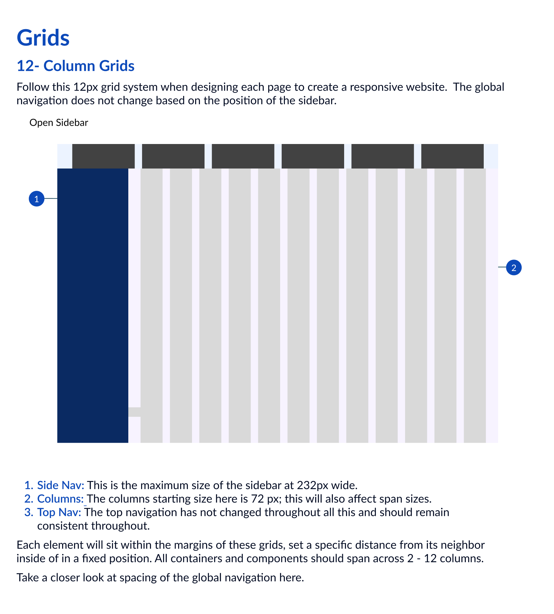
Creating a precise grid system that is responsive and takes all possible layout variations into account. Build simple, clear guidelines around spacing.
Detailed documentation for new and existing designers to follow each guideline with examples of usage
Create design tokens and variants in Figma for ease of use
Make sure spacing follows modern design aesthetics and *best practices
*Whenever looking at best practices, I also make sure to understand why these decisions are made. The goal is not to duplicate existing product libraries but to understand how best to build ours so it meets SMC’s unique needs.

The Process
Chat with everyone important
Before beginning more specific research related to the grid system, I sat down with the head of each product and engineering to understand the goals and needs of the design system.
I created a question guide to help facilitate a discussion and create alignment across all teams involved. Some of the questions I asked:
What is the timeline and bandwidth for both the product and developer teams?
How much of the existing build are we expected to hold on to
Are there key components that are top priority?
The goal is to unify our design language across all the business units. This will include layout, global navigation, a simplified grid system, a color palette, and typography. Are there any blockers or objections that need to be talked about?
The key themes that came from the interviews were:
The design team is eager to get started with the improvement of the design system, but the developers have limited bandwidth
Developers expect us to research and follow best practices and naming conventions when building. They will follow suit.
Time is limited, and the product team will set priorities.
Implementation of the design system will be done in phases as crucial components are ready. This was agreed upon with some pushback from product managers and developers.
The business goal is to onboard and retain new clients and users and rapidly ship completed products. Ultimately, the design system aligns with these business goals, and it was an essential part of these meetings to advocate for that.


Research
See what we are working with
I began conducting an audit across all the existing products and learned quickly that the spacing was inconsistent across products, pages, and UI components. The current designs did not follow the 8-point grid or any uniform layout methodology, and many components did not fit into the out-of-date 12-column grid system.
Creating a uniform design language across all SMC products was important because research shows an easy-to-use system for businesses bundling multiple tools is clients' biggest draw. A design system saves time for designers, developers, product managers, and CX professionals. The design system will save SMC money and create a better client experience, leading to a lower customer churn rate CCR and a higher customer health score CHS.
I first looked through multiple Figma files with dozens of pages per product and found various inconsistencies. I captured the numerous components in a Figma file to showcase the findings and documented additional questions I had, including:
What are the key components that appear on every page?
When the company made design decisions previously, why were those decisions made?
What considerations did we want to keep for future components?
What constraints was I under regarding what can and cannot change?
What industry best practices did we want to infuse into the new design system?
Learn from the best
I chose:
Figma: An industry leader in design similar to SMC, primarily a web or desktop application. I looked closely at their design language and the grids and spacing guidelines they use.
Adobe: Has a business hierarchy similar to SMC, with multiple product offerings and a unified design system.
Google: Has a clear, public, and well-designed language and has set the stage for industry best practices. Material design is also written to be customized across devices and products.
Microsoft: Microsoft has a full suite of products and is designed consistently across all. Their design philosophy of simplicity also aligns with SMC’s
All of these companies have a significant web presence. This was key as SMC is a web-first tool, and these design systems would be optimized for desktops, laptops, and larger tablets.
I conducted a “competitive/comparative analysis.” I looked at popular public design systems like Material, Uber Base, and Microsoft.
The Changes
Now that I had a solid understanding of the needs of the company and the industry's best practices, I began by capturing which components were the most important
I documented my thought process and the teaching going forward, specifically around the 8-point grid. I advocated for the 4-point system and built out various components. To get stakeholders’ buy-in, I would show drafts of my work to my manager and colleagues to get their insights.
I broke down the most common challenges to showcase use-case examples. For example, a common challenge was the sidebar and the top navigation bar. These are key UI components that each product uses in various states. Yet, the existing components broke an essential 8-point grid without an apparent reason, meaning that the UI component and the design made it through many rounds of review without being corrected or improved.


This brought attention to another vital issue: no quality assurance process was in place. As with MVP products, best practices and good documentation were not given priority. As a result, decisions were made more to ensure the product was functional and not polished. It’s impossible to control standards when there are no standards to maintain. For the first time, the company has fully set itself on a path to create a uniform, overarching design system that would help it scale.
The Results
Build Baby Build


Based on the results of the research and testing, fundamental changes were made, including
Switching the entire grid system from 4px to 8px
While this switch will be done slowly throughout the entire design system, any new features and products being built out will follow the new size.
Three new 12-column grids for all possible needed layouts
Clear documentation on how to build using the new grid system and spacing rules
Variants and Design tokens built directly into Figma are used to create an easy-of-use
All of these updates and changes are not effective without clear documentation. Building out details on updates and teaching each user to follow the rules makes the QA process quicker and saves the design system team ( me) hours.
Teaching everyone to use it


The Impact
The grids and spacing guidelines designed here have already become the foundation of every existing and future product in SMC’s tool belt. They will also be the most basic building blocks that we will use to grow the rest of the design system.
The top 3 impacts include:
As all new and existing products adopt this new grid and spacing system, users can immediately see a more consistent and recognizable design across all their tools.
We have already seen designers saving up to 10% of their time building new features for each of SMC’s eleven products. They can efficiently use the grid styles, size variables, and detailed documentation. This relieves unnecessary mental load and saves an immense amount of time and money.
All of these will save SMC money and support business and brand growth.
